Self-pitying whinge

If you get enough rejections from galleries, curators and juries your focus moves away from the previously assumed inadequacies of your work; I’ve had enough rejections now where it’s come to the point of being the accepted process of my work. Being blunt (it’s something I tend to pride myself on) I work my bollocks off producing work that I feel has some level of integrity. On top of that I have to also hold down a full-time job – as eating paint isn’t an option. This has been the case for the last twenty years, and no doubt it will continue (I’m well past personal delusions of being ‘discovered’ and cruelly subjected to the torments of being a nine to five painter). So the process then moves, following the production of a new batch of work that has at least a vague semblance of a theme (galleries tend not to like a disparate selection of subjects all at once), on to hawking around the new pieces in the mad belief that someone would care to stick them on a wall. Being brutally honest with myself I can see why the gallery managers may have some reservations, perhaps I’ve just been extremely fortunate in attracting the odd individual buyer who doesn’t want to pack their walls with token abstracts, landscapes, spitfires, spaniels and Chinese mass-produced still-lifes, perhaps the big bald bloke with one inch holes in his ears and a cod Dutch moustache is a little intimidating, perhaps my work is just shite.
Anyway, I’ve just had another rejection, just in case you’re wondering where this little rant came from. And the excuse was the usual, particularly unoriginal “Your work doesn’t fit in with our usual client expectations.” Which in actual fact is complete and utter nonsense. It’s based on the assumption that I am sat at home randomly posting paperwork, photographs, discs etcetera to inappropriate potential galleries. I can afford neither the time nor the financial cost of not thoroughly researching potential galleries; to top it all this gallery not only seemed appropriate (I checked their existing artists on their own website), but they actually sought new submissions through an arts publication.
Anyway, like I said at the start of this, it’s no longer about the fact of being rejected. It’s now become a matter of pride in accumulating better reasons as to why a gallery (public and private) should not exhibit my work. So for your edification here are some of the more interesting reasons why I’m still a slave to evening, night and weekend painting:

  •  “We’ve been told your work could potentially offend a rural audience.” (That was from a public gallery)
  • “Our viewers don’t like to be reminded of their mortality.” (From a hospital requesting work to fill main corridors and public spaces)
  • “We don’t think work that is predominantly black and white is uplifting enough.” (Same hospital)
  • “No red please.” (Yup – same hospital again) Don’t worry, I’ve got the message now – three strikes and you’re out.
  • “We need some yellow paintings.” (Private gallery this time – after seeing my work somewhere else they asked me to bring my work the 150 miles to show them)
  • “We don’t take artists who have websites.” (I won’t bother showing it ANYWHERE then!)
  • “Perhaps you could come back when you’ve been painting a little longer.” (Said, with all due gravity, by a twenty-something year old, public gallery manager, fresh out of an art history degree)
  • ”Have you thought about doing some video work?” (From a private gallery that had never shown video work up to that point and hasn’t since – I can take a hint)
  • “It’s a bit depressing isn’t it?” (Private gallery with a healthy list of visual-dirge obsessed artists)
  • “We don’t do work from outside of London!” (No doubt they’re equally fussy about their buyers)
  • “We don’t accept unsolicited submissions.” (I bet they would if it was Damien bloody Hirst)
  • …and the best of the lot, not totally unrelated to the last… “In our position, an unknown artist is too much of a risk.”

Actually, the last bunch were right and went out of business inside a year. Serves ’em bloody well right I say…

self-pitying-whinge

” yet man is born unto flames” 2006


back to blog menu

Roman holiday

Well it’s been a while since I’ve been on here so I suppose I’d better make the effort. A fair bit has happened of late including a very nice week long trip in Rome which was a revelation (artistically not spiritually) in many ways. We had plans of the things we wanted to see over the break which included the obvious – Sistine Chapel, Borghese Gallery and in terms of specific artists, Caravaggio. It soon got out of hand though with a couple of unexpected stops. One at the Galleria Nazionale d’Arte Moderna and another at Scuderie del Quirinale. Describing paintings in words is about as useful as attempting to paint a novel so I’ll just dish out the names. At the Quirinale, after recently only going on about the lack of Franz Kline’s work (my favourite painter) available to view in this country we were presented with three by the boy – including one of the signature large black and white oils. I couldn’t believe my luck. The show was concerned primarily with the Italian painter Alberto Burri and included a beautiful black and red piece of his from the fifties – and you could walk round comfortably without the usual crush and rush of somewhere like Tate Modern – bonus indeed. At the Galleria Nazionale d’Arte Moderna (the nearest equivalent I can think of is Tate Britain) we were again presented with unknown (to us) names – which will present endless opportunities for digging around bookshops and the like:
Adolfo Wildt, Giulio Turcato, Ettore Colla, Mario Schifano, Achille Perilli, Arturo Martini, Afro Basaldella, Renato Guttuso, Mario Sironi, Felice Casorati, Giulio Bargellini.
The list isn’t quite endless but I think you get the idea. It just goes to show how limited international interest is in a specific set of canonical artists; and it was exciting to have so many, new to me, names to look out for. There’s also the whinging internal worry that the political sympathies of some of these artists may have been questionable if you’re not a fan of ‘Il Duce’. To be honest I was just looking at the work, and there was work that was far more polemically right-wing than those I’ve listed. It’s a strange area – the politics of the artist – mind you the anti-Semitism and misogyny of Degas doesn’t seem to have diminished critical interest in his work alone. Perhaps I worry too much. Perhaps I’m justifying it to myself.
Another eye-opener was seeing so much of the sculpture of Gian Lorenzo Bernini in the flesh. I’ve always considered his work to be perhaps too decorative in comparison to that of Michelangelo Buonarroti. But seeing the work just overawed me with the man’s ability. When you visit the churches, basilicas and museums of Rome you are subjected to such a wealth of sculpture, old and new, that after a while you’re able to filter out work that previously you would have thought great solid work and those that pushed the boat out just that little bit further. It sounds like an insult but it’s not meant to be one (I certainly couldn’t even begin to imagine myself attempting sculpture on that scale) but the likes of Bernini and Buonarroti make the others look like ‘jobbing sculptors’.
Various people warned me that I’d get hooked on Rome – they weren’t wrong.
Unfortunately we didn’t get time to do the Museo d’Arte Contemporaneo Roma so we’ll just have to go back to probably the most beautiful city in Europe. No hardship.
Oh – and I’ve also just picked up a beautiful book on Jenny Saville – here’s someone whose painting deserves every ounce of praise it gets. And she now works in Italy – what a star.

roman-holiday

Roman holiday


back to blog menu

Hats off to the Arnolfini

I take it all back – all that whinging about the opening show at the Arnolfini a month or so ago. Rather than be castigated for launching the newly revamped space on a poor show they should be congratulated. I’ve just seen the latest show ‘Starting At Zero: Black Mountain College 1933-1957’ and it is an absolute stunner. This was obviously the show that they were meant to open with, but due to incredibly efficient contractors etc. they must have finished a month ahead of schedule and this show obviously wasn’t ready in time. So credit where credit’s due – it’s not often these days that a project finishes early (it’s just a shame it buggers up their exhibition plan).
Anyway back to the current show.
When I saw the title I was quite excitable – the Black Mountain College was an incredible experiment in an alternative art schooling that was significant in its helping defining the course of High Modernism; when I read the publicity that mentioned Franz Kline too I was over the moon. To my knowledge there’s only one painting in a UK public collection (‘Meryon’ at Tate Modern) and a small paper piece in the British Museum – that’s it. I expected the Arnolfini show to have probably the British Museum piece and perhaps ‘Meryon’ if we were lucky, I didn’t expect to see a beautiful diptych on paper (Untitled 1952). Throughout the evening, interspersed with a lovely soft Rauschenberg (Untitled – matt black with fabric 1952), sublime photographic portraits by Hazel Larsen Archer and a beautifully textured painting by a new name to me, Lyonel Feininger, I kept returning to the top piece of the Kline diptych.
The last time I was able to wallow in Kline’s work was at the Whitechapel retrospective in 1995 where the audience was spoilt – the paintings easily outshone the works on paper, but when isolated from the great signature black and white canvases these little paper pieces have a new life. There’s no point going into an in-depth description of what the piece does, or how it looks. You just need to get down there and see this fantastic show; I’ll be making frequent repeat visits before it closes in January. You can’t have too much of a good thing.
I also met up with Paul Nash of North Sea Navigator, who seems keen on doing some collaborative miserable-as-sin audio-visual thing – which would cheer me up no end. It’s nice to abuse a masochistic audience every now and then.
So all in all – a good evening.
The Arnolfini’s got a new director as well. Tom Trevor – an artist – promising.

hats-off-to-the-arnolfini

Screen presentation with North Sea Navigator at CUBE cinema, Bristol.


back to blog menu

Turner Prize 2005

Painting could be the new rock and roll. Or not. It’s Turner Prize time again and this time there’s a painter. Ooh yes – a painter; a real one too. Not an ounce of irony squirted about a post-modern canvas to be seen. I’m not expecting this critical largesse to expand and soak up all us saddos that have been rattling around in curatorial oblivion like an emergency rescue sponge. It is quite funny watching the broadsheet critical back peddling though; whether it will extend to a wholesale reassessment of the many excesses of second rate conceptualists or installationists or whatever they call themselves we’ll just have to wait and see. I can’t say that it would be wise to hold your breath – there’s far too much moolah tied up in too many ‘important’ collections (private and public).
There was an odd personal aside that occurred when reading Adrian Searle in the Guardian today. ‘Gillian Carnegie is a surprising choice… Finding your own voice as a painter can take a long time.’
Critics seem to be able to find their voice soon enough, and change it with the wind. I haven’t got a clue what my painter’s voice is… perhaps that’s the problem. There’s too much competing shouting going on in my head whenever I pick up the brush.
Anyway, following Searle’s comment, are we to assume that finding your voice as a conceptualist/installationist (whatever) is therefore easier? BURN THE HERETIC. Carry on like that and he’ll be drummed out of the cosy club.
I was at a show the other day that was almost stuffed to the top of the skirting board with conceptual depth and a fellow punter (a stranger to me) was contemplating a strange assemblage of corrugated cardboard, wire, plaster and other mystery accretions. He smiled knowingly, I think he may even have nodded slightly, looked at me and said ‘Fantastic isn’t it’.
It wasn’t a question; it was a statement. I took the opportunity handed to me and asked what he meant. Was it literally ‘fantastic’ or did it just impress him some way?
It impressed him.
I asked him why; was he impressed as an aesthetic response to the work or at some mystically revealed message imparted across the stripped oak that made him ‘reassess his relationship with the incongruities of a public gallery environment celebrating the creative personal detritus of the artist’ – as the work was apparently meant to do.
He started to load that old expression of ‘hedgehog discovering motorway’ so I calmed his concerns that he was being harangued by a nutter and explained that I considered myself a practicing artist and was just interested in his response to ‘challenging’ work.
‘Well – I just like it’. I thanked him and moved on before he reported me to THE AUTHORITIES…
That’s okay then – he just liked it. Fantastic. Can’t argue with that can you?
There are a hundred and one critics only too eager to jump into the fray to take down the country’s (apparently) most popular painter Jack Vettriano on the grounds that his paint technique isn’t that hot. The same people aren’t generally quite as vitriolic when it comes to assassinating second rate conceptual work. I presume this is either because they don’t know enough cod philosophy to challenge the artistic or curatorial ‘insights’, or they ‘can’t tell shit from pudding’ as an old boy I once knew used to say.
Perhaps the game’s up at last, the tide does seem to be turning a little. Good job too. It’s not only a good thing that you can you have too much of.

turner-prize-2005

“Treatment resistant” 2008


back to blog menu

‘Against the disease of writing.’

‘…one must take special precautions, since it is a dangerous and contagious disease.’
Pierre Abélard writing to Heliose.
Artist Juno Doran did warn me. Be careful or you’ll get sucked into the perpetual non-working state of bloggophillia. I can see what she meant – unfortunately she presumes that I have the attention span of at least two goldfish, when it is well known that my attention span would be challenged in duration by a single, impatient and late for an appointment goldfish. But I did find myself thinking this morning, as I ambled down the hospital corridors where I work, taking in the displayed art hung for our cultural edification. I was wondering what the accumulated variety of work had behind it – and I don’t mean the walls.
You know what they say – ‘No names, no pack drill’ so I won’t identify anyone in particular, and I’ve probably been guilty of the same thing at some time. Wall notes accompanying art, initially produced with all good intent, for the benefit of throwing additional light on work whose meaning or raison d’etre may seem a little difficult to pluck from the fathomless depths of the artistic intellect. It occurred to me again when struggling to remain silent amongst last Saturday afternoon’s Arnolfini chin-strokers. I probably don’t have enough in my life but this thought has obviously been driving a mental bumper car around my head since the weekend.
If I assume that the art is not only produced for the artist’s cathartic benefit but also for the audience’s interested consumption what is the correct way to interpret contemporary conceptualism? I presume its very nature of tending to avoid figurative representation and ‘traditional’ media would suggest that any response would have to either fall into one of two categories, the aesthetic, formalist criticism or a social enquiry response.
If the meaning or purpose of the work is tied to our aesthetic interpretation then the only purpose of the wall note should be to tell us the barest minimum about it (for reference purposes perhaps) such as who was responsible, when it was created, perhaps even who owns it.
If the meaning is tied to the artist making a social or philosophical observation – which would suggest an intrinsic role of communication – then the work is by definition poor, if it cannot be interpreted without an intermediary wall or catalogue note.
If the concept can be so succinctly put across surely it makes the artwork redundant.
So I’ll be happy to enter an art gallery and see referential supporting evidence for both older painting and sculpture and contemporary work when it applies to a history that we may not know.
I’ll read the wall notes if I want to know who made the work, but I don’t want an explanation that the work itself should be offering.
I’ll also happily accept an empty gallery pasted with row upon row of notes that expound great philosophical or social insights, unencumbered by the baggage of inadequate artifice – but I think these may already be in existence and go under the name of ‘libraries’.
It wouldn’t be so bad if the ubiquitous wall notes ever said anything different. Unfortunately they generally contain the same art phrases and clichés about the work ‘challenging the viewer’s preconceptions’ or ‘addressing the issue of.’
For once I’d like to challenge the artist’s arrogant preconceptions that the viewers are so unenlightened and ignorant that they require their preconceptions to be challenged by a twenty something recent fine arts graduate. Similarly, though art has a role in highlighting social issues and political agendas it rarely goes beyond the function of preaching to the converted.
If words are needed in the work I’ll include them in the work and not on the wall by the side of the work.

against-the-disease-of-writing

No wall notes required


back to blog menu

A waste of (white) space

I’ve put off the writing of this for the best part of a week. Just to make sure that the ire I felt was rashly conceived, but it wasn’t. Last Saturday I visited the Arnolfini in Bristol for the first time since its reopening following a two year closure and revamp; I think the words that adequately sum up the opening exhibition are ‘lacklustre’ and ‘sad’.
The new space isn’t too bad though the apparent reduction of the bar/cafe seating is a little disappointing considering that the space previously, particularly at weekends, was a packed and buzzing meeting venue for all those that didn’t mind being seen in a gallery. It becomes particularly irksome when you bear in mind that the entrance foyer area is a comparative waste of space that seems also to have eaten into the bookshop. I might be wrong; perhaps it’s a cunning architectural sleight of hand and in actual fact the shop and bar have expanded but in a trans-dimensional ‘Tardis-like’ fashion they only seem smaller. I knew I hadn’t given sufficient benefit of time to this – I’m getting sarcastic already.
Generally the exhibition space, which admittedly is the venue’s prime function, has improved. There’s more of it, it’s better laid out (and accessible – which was one of the main reasons for the change so I’ve been told) and better lit and presented.
There – I’m not totally negative – back to the opening show.
From friends who have some previous involvement at the Arnolfini I am on the understanding that prior to the closure the exhibition schedule was set around about eighteen months in advance. The closure itself was about two years in length. There was every right to expect a show that would knock the socks off an expectant Arnolfini starved audience after this lengthy wait – but I’m afraid to say that we were left wanting. Judging from the comments I heard inside the galleries, the bar and outside, I wasn’t the only one that felt cheated.
Perhaps we’ve been spoiled by a previous wealth of riches. The obvious choice of a pre-closure exhibition that I reckon the Arnolfini will always find hard to top was the show ‘Presentness is Grace’, with the conceptual genius being led from the front by the incredible talents of ÝNikolaj Bendix Skyum Larsen and Hideyuki Sawayanagi. This was the show that deserved the attention of a supposed grand re-opening, not this ‘This storm is what we call progress’ effort. Apparently – according to the material supporting it ‘The exhibition asks how, why and what we remember… these works explore our complex relationship to the past as well as our responsibility to the present.’ No it didn’t and no they don’t. The work was perhaps worthy of supporting stronger work but not of maintaining its own head above the waterline.
And as if to support accusations of the exhibition’s ‘conceptual’ insecurity it is titled from a Walter Benjamin quote concerning a Paul Klee painting and it also makes great play of including a Turner oil – as if to include by guilt of association the contemporary work into the canonical status of Britain’s most famous painter.
The Arnolfini is known for showing primarily conceptual performance, screen or installation based work over ‘traditional’ art media (unless of course you’re Beatle Paul McCartney and you need a venue to hang your cod, retro, pseudo New York School paintings – but that’s another bitter, twisted subject). If I want to see good painting I’ll pop up the road to the Bristol City Gallery and catch Karle Weshke’s Leda and the Swan.
However, if I want to catch top notch contemporary weird shit I’ll go to the Arnolfini. Unfortunately this wasn’t it. An apparently slung together table top construction that defied any aesthetic interpretation; I therefore assumed it must have been challenging in the sense of the new way it wanted me to see some part of my world. Nope – not unless I resorted to reading the associated wall notes, in which case I would suggest getting rid of the work and leaving the wall notes. A video, tedious in its monotony, painful in its shaky-helicopter-cam pinkness and unoriginal in its guilty liberal, politically correct subject matter (documentary style apparently). I would suggest that its supposed intent would best be rendered by an authoritatively written, competently shot documentary – probably. These were probably the day’s worst, though not only, offenders of reinforcing the public’s incomprehension of contemporary art. The whole event was another exercise in pseudo-intellectual, politically correct, cod-philosophising of the highest degree.
‘This storm is what we call progress?’ No it’s not – if it is a storm it’s more Typhoo than typhoon, and as for progress… It’s just another piss-poor, deliberately obscure show that hangs on the now ragged coat-tails of a seventy year old allegedly anti-art, anti-establishment ideal. And for the opening show of the major local venue, with a supposed two to three years preparation time it was a bloody farce.

a-waste-of

“finding the courage to be a fuck-up”


back to blog menu

Television is fantastic

You know – I’m getting quite comfortable in my slow metamorphosis into a miserable old bastard.
Television is, in general, one of the greatest modern inventions devised to increase personal motivation. Marx reckoned that religion was the opiate of the masses – he didn’t count on the work of John Logie Baird then. I suppose I am fortunate then in that I am one of those lucky individuals that can dip in and out of the drug bag without being sucked into perpetual dependence. The absolute inanity of 90% of the programming does nothing but motivate me to do something less boring – which generally means painting.
People, inside and outside of the insular world of art, wonder at the productivity of artists such as Michelangelo, Picasso and Van Gogh. Where did they get their time and motivation? They found it internally, quite easily, because they weren’t being neutered by an all pervasive popular culture that invaded both the actual living space and non-domestic community space.
I’m glad that I don’t understand any of it. In all honesty I don’t even want to understand any of it. I’m glad that I don’t know why the new TV comedy is funny, I’m glad that the current state of journalism is neither impartial or truly investigative, I’m glad that in general the new popular music seems either derivative of music I listened to in my teens or is totally incomprehensible. In another socially cultural avenue I’m glad that the new fads in fashion are passing me by. I’m glad that television, mainstream cinema and in general most of the news media are doing such a piss-poor job. Because it means I have less justifiable distractions from getting on with painting – and at the age of forty, if I am lucky, I might have half my life left to apply myself with some level of determination to produce some worthwhile work.

television-is-fantastic

“Icarus (be careful what you wish for)” 2005


back to blog menu

Honest work

Artists have a responsibility to engage initially with the general public before producing work aimed at the attentions of the art critical establishment. Artwork produced for the insular world of art academe will rarely stand the test of time despite perhaps achieving initial high praise. When the artist has gone and the fashions have changed all that will be left is the work. The only constant will be an audience that has a minimum of actual lived reference to the times the work was created in. Work made for a public audience is honest work and honest work is the best the artist can hope to be remembered for.

honest-work

Work from the “Paradiso” show, London.


back to blog menu

A funny thing happened…

…on the way to the Tate.
A planned day of work unexpectedly turned into a day of time with old friends, but rapidly descended into the rabid pit of art world inspired lunacy.
A recent trip to a London gallery to deliver some work for exhibition was preceded, quite unexpectedly, by a phone call from Mexican artist Luis Ituarte and his film maker partner Dr Gerda Govine-Ituarte, who I’d struck up a friendship with a month earlier in Florence. They were on their way home via London and were planning on visiting the Tate Modern. Would we like to meet up? In all the time this alleged powerhouse of high culture has been open my partner and I had never actually had time to check it out – so indeed this seemed quite fortuitous. Another chance to catch one of my favourite paintings in the country – Franz Kline’s ‘Meryon’ in its new gallery setting.
The following day we set off early – everything was moving along fine. We enjoyed an untroubled drive up the motorway (which has never happened before), dropped off the work at the gallery, took a lazy amble up the road to the nearest tube, and waited for our train into town.
Before we can get on the train we’re interrupted by another phone call – this time it’s Joe Mangrum, another artist we met at Florence; he’s on his way to home to San Francisco via London where he’ll be this afternoon. Did we fancy meeting up? At the Tate Modern perhaps? What started out as a good day just kept getting better!
So after a pleasant tube ride (again never a common experience), some great tube station modern architecture and a short walk we get to Tate Modern. Expectantly we descend the entrance ramp and behold the current media hyped spectacle, Olafur Eliasson’s ‘Weather Project’.
Which is fine. In a big yellow sun in a hotel basement garage kind of fashion. I think we’re convinced of its implicit greatness through its explicit BIGNESS (there’s a job here for a mathematician to establish the exact quantitative relationship between artistic seriousness and BIGNESS – a zippy little equation shouldn’t take too long to whip up). Needless to say there’s no shortage of punters oohing and aahing (the atmospheric wonder of breathing difficulties in cold ice for asthmatics), rattling on about the sense of ‘the spiritual’ in this work, the ‘monumental scale’ of the work. These very same punters would likely walk right past the Gothic leviathan that is Cologne Cathedral because it was a ‘church’. Despite the fact it took six centuries to complete and has the kind of presence that can only be related to, in an aesthetically atheistic fashion, as some great, Armageddon inspired, smoke blackened, extra-terrestrial landing – unless of course it was on a modern art tourist map – perhaps the Germans should rebrand it…
Anyway, at the Tate we met our friends. Amongst the happy-clappy art-world, new-age hippies running up to this Glastonbury festival installation, raising their arms and chanting art bollocks mantras to an artifice of sun in a very dull day coloured brick warehouse.
We couldn’t cope with the dark anymore and didn’t want to waste what short amount of time we had left turning blue from a combination of UV deprivation and carbon dioxide inhalation. We thought the best way to attack a one afternoon visit to the Tate was in relating it to Dante’s Divine Comedy (even the title seems appropriate in retrospect) so we started at the top, with the noble plan of descending the seven levels of hell, sorry – artsville.
Like lemmings in a cultural IKEA garage we were shepherded by the Saturday afternoon art-shopping crowd around the current curatorial favourite of randomly associated collections of cultural artefact. Bill Viola attempted to confuse and confound with pseudo religious video doom (in a lightless room of course). But his attempts at messing my head up counted as naught in comparison to the frottage and beating dished out by other viewers – I think I actually stood on two student fans of Mr. Viola (serves ’em bloody well right for attempting a transcendental experience on the floor of a dark room) and I also unwittingly hoofed a discarded drinks carton into somebody in a fashion that would’ve inspired Pele.
I’d recommend art critics view this work in the same kind of lunatic conditions that we, the general public punters, have to. They might hold back some of their literary hyperbole when they have to fight for the right to view in an atmosphere of body odour, loud whispering and bodies on the floor whingeing at being stood on or fallen over.
Elsewhere in the asylum the usual chin strokers were fondling their goatees at the usual suspects. Stressy attendants were hassling a snappy happy photographer whose flash light was obviously threatening to permanently erode a Rodin bronze. The ‘beautiful people’ were sucking in their cheeks for the benefit of the other ‘beautiful people’ who were pretending not to notice by wearing black sunglasses – this in an art gallery did obviously not strike them as odd behaviour. Perhaps they were being ‘ironic’ and not ‘moronic’ as I initially interpreted it. And of course there were the culture tourist victim kids in tow, ever going on in an ever honest kid fashion about ‘that’s not art Dad – that’s crap’. And Dad’s tried to explain the intricacies of twentieth century art theory versus ‘crap’ to kids who’d rather be bored at home in front of one television showing Big Brother than bored here in front of a bank of boxes endlessly, relentlessly showing repeats of Bruce Naumann TV.
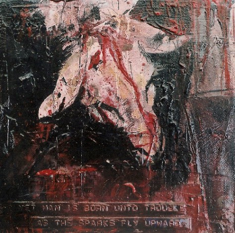
THANK GOD for Franz Kline’s ‘Meryon’. It was the cheesecake and double cream desert to the soylent green dog’s dinner of much that we saw that day. It enlivened me like a double espresso, morning nicotine fix and sent me on my way – to a moment I shall hold as an epiphany in my obviously ever sad, art-world life.
I did take the name of the work and the artist – but my ensuing euphoria at having been kicked in the mental bollocks by new art has since hoovered the names away. And it doesn’t really matter – it could quite literally have been by anybody.
We entered a room; a relatively quiet room considering the mayhem of the preceding exhibits, and came to a Tate note on the wall. Usual sort of nonsense – metaphysical horse-shite puddle-deep title, artist’s name, year of creation, collector, corporate sponsor etcetera. And the work itself.
A door. Perhaps twelve feet tall or more, with huge great steel hinges AND NO HANDLE. God – the significance of this work seemed otherworldly to me after the experiences upstairs. I may even have stroked my chin in some representational orgy of mental onanism. Hellfire, I was mildly impressed. Thank god something contemporary in this museum hell-hole had moved me (if only two inches to the left). I was even enthusing with Gerda over the quality of this piece.
Now I’ve never professed to be the world’s foremost font of art theory and history knowledge, but from the age of eleven my parents bought me art biographies because I wanted them. I’ve read on art, art history, and art theory since because I was obsessed with the subject. I’ve always practised the visual arts, from the age of eleven I’ve been painting with oils. And I’ve kept a fairly solid record of the work I’ve created over the last dozen or so years. I’ve had discussions and arguments with curators and gallery managers who’ve been only too willing to display their limited knowledge rather than admit to it. I’m not unaware of the contemporary developments in fine art – officially sanctioned, state supported or otherwise. But this got me.
I turned to the left to leave the room and enter the next gallery and saw in the next room the exact same door.
Same hinges, same height, same aesthetic (i.e. none) and importantly same lack of door handle. I returned, in a puzzled kind of fashion, to the original ‘art’ door with its ‘art’ plaque of authenticity. Slow dawning realisation – in a rosy cheeked fashion if you get my picture (Gerda comes to the same conclusion simultaneously and laughs hysterically at my dumbfounded state). The plaque in fact had referred to the artwork to its right, not this door to its left. The door was plainly and simply a bloody door.
I, with the accidental assistance of the Tate’s curators, had mistaken it for a piece of art. The title was so vague that it wouldn’t deny the relevance of it. The supporting exhibits so ‘sublime’ that they didn’t deny the truth of it. And my tacit acceptance of the museum’s authority through mere presence wouldn’t deny the validity of it.
I’d been had. But not by some sly, shooting from the hip, tabloid TV anti-art hack or a wit ridden YBA, but by myself. Brilliant!
So what chance do the general public stand when they come here with some vague notion of attaining cultural enlightenment?
Next I had visions of security guards lurking in a darkened room somewhere, taking the piss as they sit watching that corner of that room, taking odds on which Tate Modern punter is next going to stand in front of that door, read that plaque and stroke their bloody chins in art world wonder.
I’m not sure which divine levels led to which divine moments of enlightenment – but the toilets definitely led to another of their own. I can’t have been the first person to think it – but well, that environment kind of focuses the attention into art world solipsism. I’m in the loo of British Modern Art plc pissing on a replica Duchamp. I mentioned this heresy to my fellow denizens of the pissoir but it was just so much grain tossed onto the barren sod of the day’s ongoing high art sitcom.
The Tate Modern BIG art experience could only be topped with a visit to the Restaurant (non-smoking – consequently containing a great number of fretful nicotine starved artists). It looked fantastically black and shiny and modern. Stuffed with scores of the great unseated, attempting to hunter-gather an insufficient quantity of seating. Insufficient perhaps, but beautifully arranged. A kind of Corbusieresque ‘machine for waiting’.
What else awaited us following our Tate Modern branded coffee cups with Tate Modern branded sugar and Tate Modern branded milk substitute?
What could top refreshments in MacTate?
The gift shoppe. And here was the point I feel of the whole experience. Escalators whisk the expectant punters up and down the Divine Comedy like some great badly lit department store until at last, by purpose or accident, they find themselves at Tate bookshop central.
I can cope with the monographs, I can cope with the theory, I can even cope with the world’s most expensive living painter (Richter), being promoted in what was probably the world’s most expensive living art book. But the final straw was the Tate Modern branded associated tourist nick-knackery. Give away, disposable, mass-produced supposed ‘multiples’. ‘Multiples’? Must be art then – best keep ’em safe. They might be valuable one day, even if they do look like ping pong balls with ‘Tate Modern’ printed on them – best stick them behind that limited edition Elvis commemorative dinner plate.
I know I’m always being accused of being a miserable, cynical old bastard. But do they have to make it so easy? Perhaps it’s never been about art alone and perhaps I’ve got rose tinted spectacles (though welding goggles would probably be more appropriate) when it comes to my memories of the old Tate. But since the worst of the various sins of post-modernist over-intellectualism have allied consumerism as a both the subject of art and art theory – the marketing department, not the art, seems to have taken over the museum.
I’ll go back to the old Tate next time (sorry – Tate Britain) – hopefully it’ll be stuffed with old farts like me and there’ll be room to see some Art between the punters.

a-funny-thing-happened

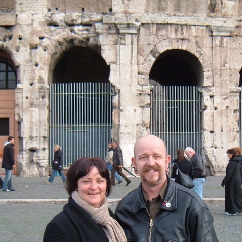
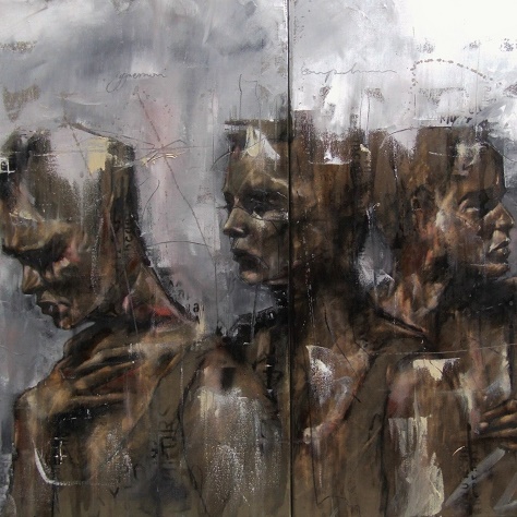
With friends at Tate Modern.


back to blog menu

GUY DENNING: QUEERING MODERNISM by Fionna Barber

In palpable silence, a cluster of androgynes stand waiting. Full-breasted women with short cropped hair, hard-bodied men with delicate features marooned in a desolate post-industrial landscape. Other than their initial beauty – a problem for some viewers – what is so compelling about these figures that inhabit Guy Denning’s paintings? Even in groups they are isolated; in many cases there is no obvious narrative connection or discernible event to hold them in relationship to each other. Even the occasional inclusion of written text (as in You’ll Be Wanting a Happy Ending Then) tends not to help in the unravelling of meaning but throws it further into question.  Yet this does not imply the absence of links between these figures. Indeed many of these works contain an underlying tension. The ambivalence of desire, its fascination and repulsion, is held in place by these static bodies. Yet there are other layers of ambivalence since neither heterosexual nor homosexual desire are exclusively addressed here, although both are called into question. Despite their isolation, significant looks (and covert glances) are exchanged between figures whose gender and sexual identity are frequently uncertain. This is where the viewer also becomes involved in a response to the artist’s challenging of easy meanings. The spectator’s gaze becomes caught up in the unravelling of a question whose answer will always be deferred. We are on slippery ground here, where stabilities of identity must be continually redefined and re-enacted. Indeed, Denning’s take on sexual politics has often been regarded as controversial: some of his earlier works, for example, explicitly dealt with fetishism and objectification, issues that feminism has problematised for male artists especially. Consistently, however, his work has challenged orthodoxies of representation of the body or even identity itself. Matters are  queered further by the recurrent image of an androgynous short-cropped woman throughout the paintings, described by Denning as ‘an imaginary self portrait’. Yet the performance in his paintings of a distinctly perverse identity is one with an honourable precedent in the disruptive histories of modernism. Marcel Duchamp’s alter ego as Rrose Selavy comes to mind, although taken several stages further in the male artist’s fantasy of ‘his’ female embodiment. It is important that this should also not be confused with some reductive sense of ultimate possession and domination, as being ‘in’ the female body, but the deployment of desire as a challenge to the very limits of gendered subjectivity.  It’s plausible to view this not just as a project of queering identity, vital though this is in the current war zone between conservatism and its repudiation. The radicalism signalled by Guy Denning’s practice is also due to its take on painting’s past – a matter, ultimately, of queering modernism itself. During the early 1990s a significant part of his practice mostly took the form of abstract gestural paintings, incorporating an enduring interest in the work of the Abstract Expressionist painter Franz Kline. Concerns over modernism’s exclusivity of audience and the problems of repeating an established history led, however, to their abandonment in favour of photocopy work some years later. Even at this early stage Denning’s relationship to modernism was somewhat ambivalent. Despite the pleasure in painting for its own sake engendered by modernism’s belief in its own autonomy, the artist’s fascination with the sweep of Kline’s magnificent gestures also included a sense of critical engagement. Denning’s abstractions at this point were also concerned with the attempt to reclaim the gestural brushstroke from the associations of normative heterosexual masculinity. Kline’s work may be regarded as perhaps perversely suited to this form of re-reading. It’s almost as if the sheer excess of his painterly gesture conveys something closer to a hypermasculinity, with the artist as competitive bodybuilder staging his performance within the picture plane.  One further instance of an ambivalent relationship to modernism, also with far-reaching implications, is Guy Denning’s take on Degas. Degas’ painting The Young Spartans (1860-62) has been reworked by Denning in contemporary terms to depict a group of five male and female nudes in a bleak setting, whose air of urban decay contrasts sharply with Degas’ verdant landscape.

0053 the young spartans 153 x 97cm

The tensions of the earlier painter’s engagement with the sexual politics of mid-nineteenth century France are re-engaged in terms of late 20th century issues of ambivalent identity. But this encounter is also about the process of painting itself, and the sense of pivotal moments in modernism’s history. Degas’ painting was one of those that marked the birth of modernism, in both the flatness and strangeness that brought an uncanny sense of modernity to its classical subject. It also suggests an ambivalent relationship to both classicism and modernity. This tension re-emerges in Denning’s practice, which suggests why Degas’ similar  sense of contradiction may have seemed so attractive to him. However in Denning’s version the referencing of the past, including direct quotation from Degas’ painting, has been further complicated by the hindsight of modernism both in the representation of his figures and the ground they occupy. Without wanting to over-simplify matters, classicism privileged certain types of representation of an idealised male body, whereas it was the female body that became the locus of innovation in modernism. In his Young Spartans these two moments in the body’s history have been brought together in an uneasy relationship through an insistent androgyny. Yet this painting also suggests the linking together of classicism and modernism on a more complex level, despite the continued pleasure in the process of painting which for Denning is identified with the practices of modernism. The conscious evocation of classicised bodies exists in a setting that reeks of the end of modernity, the end of a culture of progress and optimism that provided the conditions for modernism to flourish. This disjuncture suggests a tension between real and unreal, that in a world undergoing the entropy of modernity the idealised body can exist only as fantasy, given form through the artist’s desire.  There is a similar tension between the contemporary and the classical in Icarus (Scapegoat for an Atrocity), a work that possibly marks the conclusion of Denning’s current preoccupations. Although derived from Greek mythology, the title also refers to both the imagery of 9/11 and to possible interpretations of its causes. This is not to condone the actions of the perpetrators, but to suggest the cost of late capitalism’s failure to recognise the consequences of its own actions. Yet despite its origins in a specific event the painting deliberately lacks specific focus; the bleakness of its setting and anomie of its figures imply a lack of blame beyond a shared responsibility. What Guy Denning has produced here is in fact a contemporary history painting – one that evokes its classical precedents, but refuses moral judgement beyond noting the terrible fall of idealism.

1701-we-are-all-prostitutes-aggression-competition-ambition-96-x-61cm

© Fionna Barber 2003 (Senior Lecturer Art History, Manchester Metropolitan University)

back to blog menu